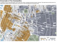
Atlantic Yards heat maps
 Today's NY Times Metro section has a sizable article on race and salary in the
  Atlantic Yards environs. In the heat map on income, there's a small pocket off Atlantic by 3rd Avenue that has an average income of over $100K. What part is this?
Also interesting to note is that in the owner-occupied map, there are two areas where there is a high owner-occupancy rate and guess what, they're historically black co-op buildings - the one at Ashland/Myrtle and the 185 Hall St. coops. I might be wrong, so someone please correct me.


3 Comments:
Interesting article, I read in the Times yesterday. Unfortunately, this is based on the 2000 census and I bet these maps would be very different based on a current census. Especially white people in Fort Greene and average household incomes in Fort Greene. In fact, I bet this is so different the maps hardly reflect the situation at all.
You bet? You think? What kind of bullshit response is that? Is that something others are supposed to rely on in a debate? Is that any sort of critical thinking, the kind needed to win debates? And people wonder why Ratner has the upper hand in all this...and he does...period.
Thanks for your useful info, I think it’s a good topic. So would you like the info about the Air jordan shoes
ugg bailey button boots
Christian Louboutin
Michael jordan shoes
cheap jordan shoes
Bose headphones
CHI flat iron
Michael Jackson Memorial
wholesale electronics
jordan shoes
MP4 Player
classic ugg boots
jordan shoes for sale
ugg Gypsy
Post a Comment
<< Home